
Presentations can be a compelling way to showcase your knowledge, experience and specialisms. Delivering a successful presentation is not just about how you speak, it’s also about the quality of the supporting information you use. For most of us, this comes in the form of a slide deck.
A great set of slides grabs the audience’s attention and keeps them engaged throughout the presentation. It maximises the impact of the information you have to share, it’s visually appealing, consistent, and should leave your audience wanting more. Your slides should act as visual prompts to help you tell the story of your presentation; each one should complement the narrative you’re telling.
Unfortunately death by PowerPoint is a common side effect of many corporate presentations. It starts with text heavy slides that are light on images. The presenter reads every slide word for word and, slowly but surely, the audience lapses into sleep mode.
But by following some basic design rules, it is possible to create powerful, engaging and impactful corporate presentations yourself, without having to enlist the services of a designer. There are many free tools available to help you do this.
Make sure your presentation stands out for the right reasons by following these three simple rules.
Simplify charts
Charts are a helpful way to simplify data and add visual interest to your slides. Make sure your charts are clean and tidy and all data labels are easy to read. Remove any unnecessary clutter such as grid lines, background colours or labels that may detract from the point you’re trying to make. This will make it easy for your audience to absorb and engage with the information you’re presenting. Create all charts in a consistent style and format throughout your presentation.
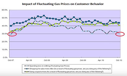
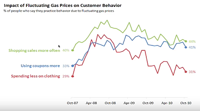
The charts below from Cole Nussbaumer Knaflic (Storytelling with Data), demonstrate how you can tell the narrative of your data far more effectively by reducing chart clutter and making best-practice design choices.
In the second, simplified chart Cole has removed the background colour, grid lines, unnecessary axis labels (and the axis themselves), all but the essential data points and added the colour-coded labels next to the datasets to which they relate.
Along similar lines is another chart from Cole, which demonstrates how simplifying colour choices and removing unnecessary content can provide a much more accessible chart for your audience. By highlighting only what’s needed to reinforce the story, you can focus their attention on the key points being made:

Both of these examples are included in this brilliant data visualisation webinar . If you want to learn how to create professional looking charts and have a little more time to spare, I highly recommend checking it out. Cole’s blog – Storytelling with Data – also shares lots of useful advice on how to reduce chart clutter and get your point across effectively.
Choose colours wisely
Ensure your slides stand out from the crowd by using a smart and appealing colour palette. Avoid the standard colours generated by your presentation software and source inspiration from these online resources instead:
- Pinterest is a brilliant free source of creative inspiration
- Canva has a great selection of free and low cost graphic templates
- Adobe Color CC (formerly Adobe Kuler) provides a wide range of colour palettes that you can pull straight through to Adobe’s Creative Cloud software
- Color hunt has hundreds of colour schemes to choose from and helpfully provides the hex codes for each so you can easily apply them to your own slides.
As with the chart examples shown above, carefully choosing where and to what extent to add colour can make a big difference to how (and how well) your audience interprets your data and information.
In terms of legibility, as a general rule dark text on a light background is easy to read. Keep a high contrast between chart colours and any text. Yellow text on a white background is a complete no-no!
Obey the typography hierarchy
This sounds complicated but I promise it’s not! Typography describes the text you use on your slides. The hierarchy refers to each level of text, i.e. headings, sub headings and body text.
Every heading on every slide should be consistent and have the same font, font size and font weight. The same rule applies to sub headings and body text. Avoid trying to make every part of your slide stand out. If everything is trying to grab your reader’s attention, nothing will, which is why you need to create hierarchy of information and stick to it.
You should also check bullet points for consistent formatting, spacing and indentation. An inconsistent approach to typography hinders the flow of your presentation and makes it difficult to read, follow and understand.
If you’re not bound by corporate brand guidelines, you can make your presentation truly unique by choosing a non-standard font for your text. Try font squirrel or Google fonts if you’re looking for typography inspiration. Just remember, less is usually more!
Feel free to message us directly if you’d like more advice on how to create more professional looking presentations or slide decks for you or your team.