An average of 66,000 pieces of content are uploaded to Instagram alone every minute. The average user spends just 53 minutes on Instagram a day, so how do you make sure that it’s your posts they choose to engage with? In today’s digital landscape, creating engaging content design is a crucial part of every marketing strategy. From independent artists, to global brands, content can be responsible for 87% of conversions.
So, what is the role of design in engagement?
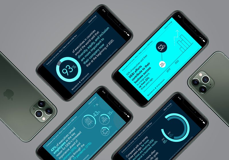
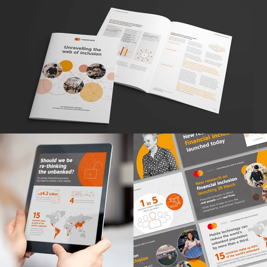
It is often believed that the purpose of content design is purely for aesthetic reasons and, while this is a benefit, there is so much more to it than simply fitting the theme of your grid. A well-designed piece of content has the potential to increase engagements, and therefore conversions, and build trust and credibility with users. This is achieved by strategically incorporating specific design elements to convey your message in its simplest, most comprehensible form.
This may be a simple as having easy-to-read text with visuals to support the message. Users are more likely to engage with a carousel of single pieces of information, than one image filled with text. You can test this yourself too; share a carousel with the same information you would usually compile into one image and see the difference in the number of saves the carousel has.

It is important to consider the users’ learning preferences too; some may be visual learners, while others may prefer written learning. You will increase your chance of engagement simply by catering your design to both.
Sharing a professionally designed piece of content aids in credibility too. Are you more likely to trust a visually appealing, high-quality post over a mismatched, low-resolution image?
What are the best practices for content design?
Credibility can also be achieved by creating a consistent design aesthetic across all content. The aim is to have your audience recognise your content upon first glance, purely based on content design. This can be achieved by having a strong brand identity.
When crafting your brand kit, it is important to consider the versatility of the design elements. For example, is your chosen font easy to read and in line with your brand’s tone of voice? Do the colours used relate to your product or brand’s message? There have been many studies regarding the psychological effect of using specific colours. Just think about Facebook, X (Twitter), LinkedIn; social networking platforms tend to use blue as it encourages creativity and appears trustworthy.

It is important to use this brand kit across all content, from newsletters to social posts, to build a strong brand identity that is easily recognisable and increases engagement due to their immediate trust in you.
You should cater your content to be accessible for all whenever possible. You can do this when designing by simply having text large enough to read in a colour that stands out from the background. When sharing the content, it is wise to use the ‘alt’ feature to describe the design in great detail so all users can understand your content.
Here are some best practices when creating infographics, as well as a free template for you to use: https://nwc.design/how-to-create-a-good-infographic-free-template/
How do you use design to meet your users’s needs?
With platforms seemingly encouraging quantity over quality these days, it can be easy to get lost when designing and forget the true purpose behind your content. More often than not, your content is designed to help people, whether that may be sharing information on a topic, or advertising a product they may be interested in.
The more content you create, the more insights you’ll have into what aligns with your audience. This should be implemented into your design strategy. Analyse their content style preferences and the topics that they interact with the most. You will likely find patterns in this, for example, a popular topic may solve a pain point for your users. Keep this in mind when designing your content to continue with high engagement and build a relationship with your audience.
What should be considered when designing for mobile and other platforms?
A recent study showed that over 95% of users access the internet via their mobile phone. Your content must be optimised for mobile view. Although it can seem less significant while most design is done with desktop optimisation in mind, you could be losing conversions simply by having design errors in mobile view.
In the analytics section of your social media platforms, email marketing and website hosting, you can see for yourself which devices are used to access your content. Here are some tips you can use as a checklist to ensure your designs are optimised for all devices:
- Ensure that buttons are easy to click on mobile, while not taking up the whole screen.
- Images should be an appropriate size and not cropped or overlapping.
- Check the loading speed of your images too, as the file size may be too large for mobile.
- Text can often overlap, so spacers may need to be used.
- Is the navigation menu clear? It may be a collapsible menu on mobile device, so make sure it is easy to find.
This can have a direct impact on engagement as users typically lack the patience to wait, especially since content is getting shorter and our attention spans with it!
Conclusion
Content design has a direct impact on users’ engagement. It is crucial in this digital landscape to design content that is easily recognisable and stands out amongst the sea of content shown to your audience on a daily basis. By implementing a consistent design based on your brand kit and taking into account accessibility, you can connect with a wider audience, boost engagement and build a stronger relationship with users. Content design is more than just aesthetics, it is a tool you should be utilising to boost conversions and create credibility within your niche. Reflecting on your own content, which element of your content design will you be optimising first?
Sources:
- https://localiq.com/blog/what-happens-in-an-internet-minute/
- https://gettalkative.com/info/how-to-engage-customers-digitally
- https://whatagraph.com/blog/articles/improve-content-engagement-rates
- https://business.scope.org.uk/article/7-easy-ways-to-make-your-content-more-accessible
- https://www.bluleadz.com/blog/why-are-social-media-sites-blue


