We love the challenge of using our knowledge of how the brain works and the design principles that stimulate it to solve the problem of presenting complex information so that it becomes more easily digestible and more memorable. The process of unravelling reams of data and creating a visual narrative that tells the story uncovered by the research is really satisfying.
Designing an infographic isn’t merely ‘making data attractive’. A key factor in producing an effective infographic is how much understanding the designer has about how the brain functions and how we process and store information about the world around us. By applying this knowledge correctly, designers can create more effective infographics because they give our brains the optimum conditions to process and understand the data quickly and correctly.
“Effective infographic designs are much more likely to create interest, and are more successfully shared on social media and other channels.”
Non Wood
How our brains work when reading an infographic
To start with we need to understand a bit of biology and chemistry. The brain uses three sorts of memory to experience, absorb and store the information it receives as we go about our day-to-day lives. These are:
- sensory memory,
- short-term memory,
- and long-term memory.
Sensory memory refers to the five senses – sight, smell, touch, hear and taste – and it’s sight which is paramount when it comes to infographic design. Iconic memory, as it’s referred to, is short-lasting but it helps the brain quickly sort the information being seen.
When we look at an infographic, the information we take in moves from our iconic memory, i.e. what the eye immediately sees, to the short-term memory for initial processing, and then to the long-term memory for storing. Short-term memory doesn’t last long and can only cope with 3-7 items at a time, then long-term memory takes over and holds the knowledge and information indefinitely.
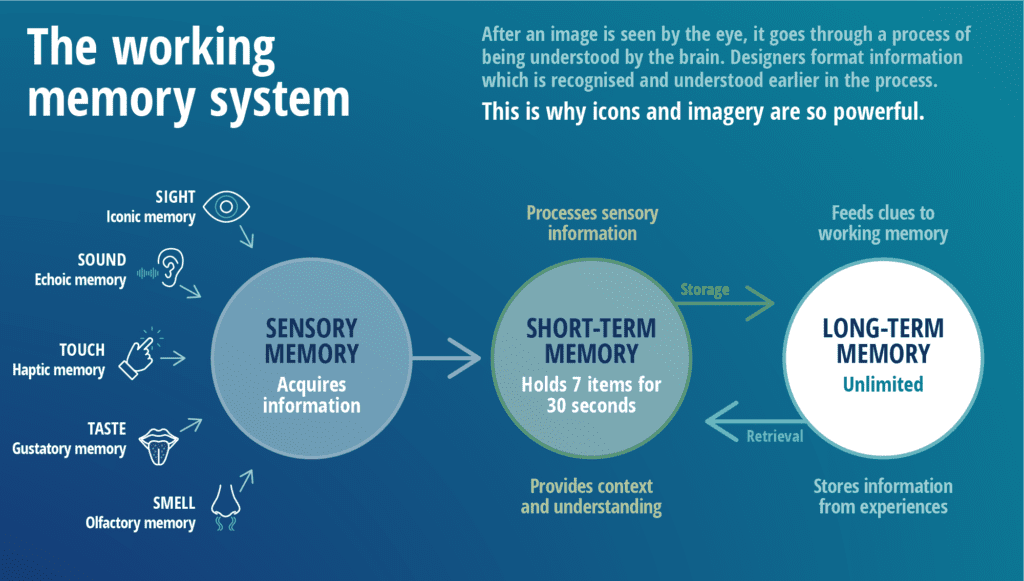
“It is the infographic designer’s job to make this process as short and as memorable as possible, so that the information is processed and stored quickly and correctly.”
Non Wood
So how does an infographic designer achieve this?
Pre-attentive attributes
Now we can apply the physics. As the brain remembers more of what it sees than what it reads or hears, designers can help by using what are known as pre-attentive attributes in their infographics. These are the elements that our iconic memory picks up as our eyes scan an object, and include:
- orientation,
- line width,
- added marks,
- curvature,
- tone,
- shape,
- size,
- and colour.
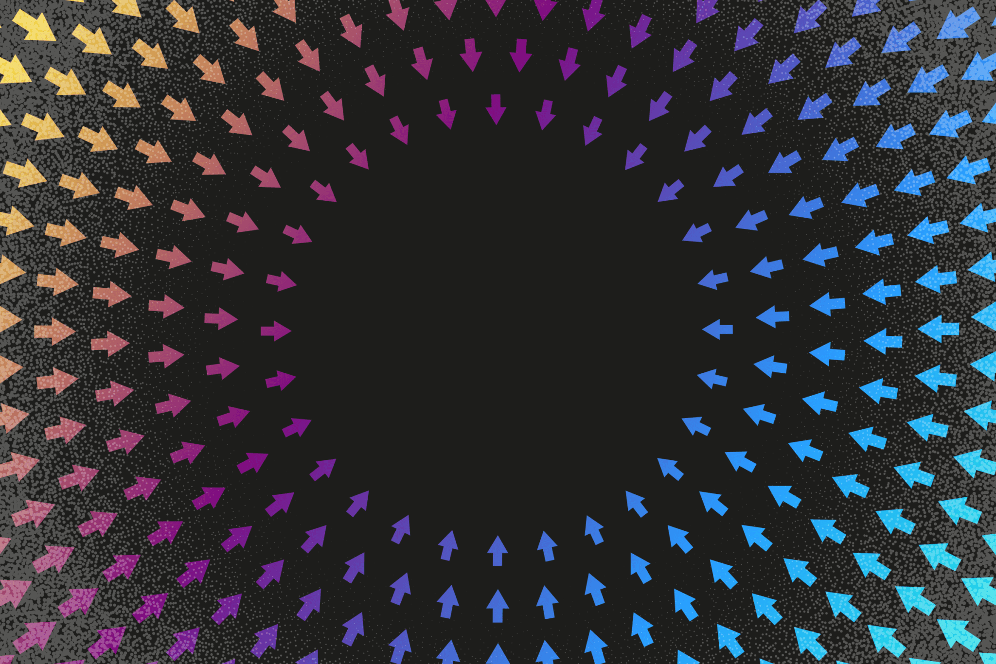
Take a look at the image below. Your brain will instantly recognise which element stands out because it is different in each case, and it is the correct use and combination of these visual devices that creates an effective infographic design.
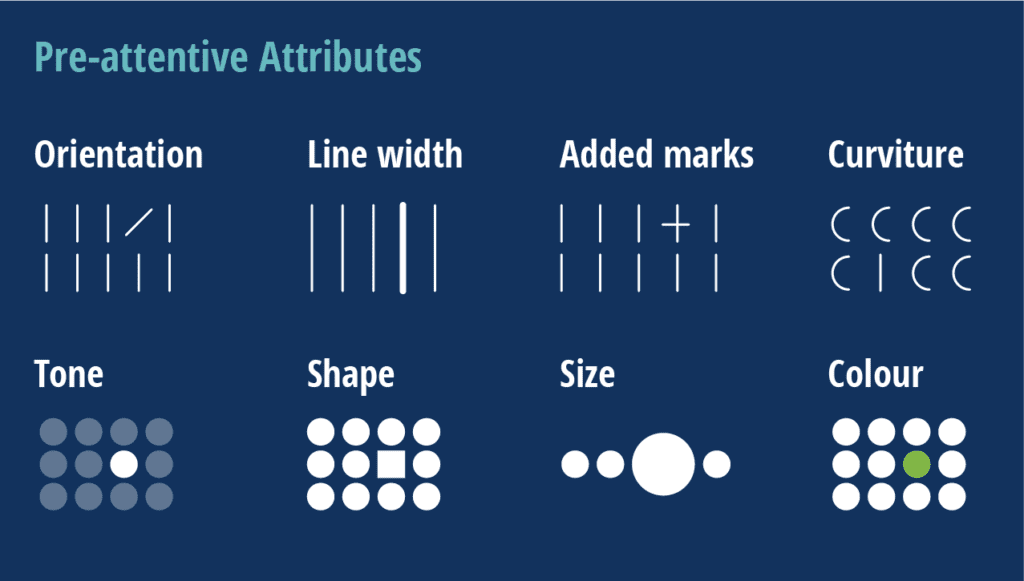
By harnessing the power of these pre-attentive attributes an infographic designer can set the scene for the brain and enable the reader to get the most from the information presented.
Gestalt Principles of Design
Another set of tools used by infographic designers are the Gestalt Principles of Design. They were introduced and developed in the early 20th Century by psychologists in Germany (Gestalt being German for ‘shape’ or ‘form’) who wanted to create a set of rules for how we view and interpret images and objects.
The principles that are most relevant to infographic design include:
- proximity,
- similarity,
- enclosure,
- and connection.
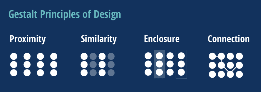
Used alongside the pre-attentive attributes, the Gestalt Principles can add further ‘instant’ understanding for the reader.
Displaying data in infographic design
A large part of infographic design involves displaying data, not only memorably but correctly. The principles behind data design are lengthy, and I won’t bore you with the detail, but in essence the design of data should be correct in that it does not distort or miscommunicate the information.
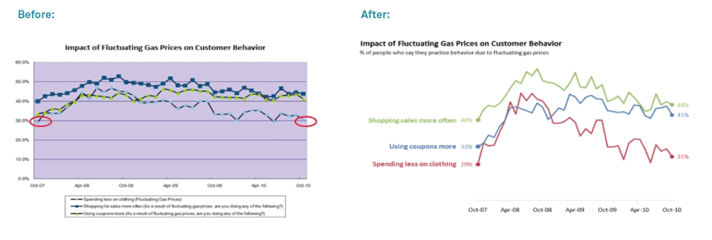
We see so many cases where charts or graphs are shown surrounded by what’s known as ‘chart clutter’. Often graphs are over-designed in an attempt to enhance their appeal and understanding. In contrast, we begin by stripping away everything that’s not required to tell the story.
In the example below by Cole Nussbaumer (her blog Storytelling with Data is fascinating!) she shows the impressive effect that this simplification process can have on displaying a dataset.
As infographic designers it’s our job to use all our resources – education, reading, experience – to make data easier for people to read and understand.
Why specialist infographic designers are different
We use these tools (and many years of experience) to help readers understand data and concepts faster and to be able to recall the information more easily by providing their iconic memory with suitably stimulating images.
Whilst the ideas and tools discussed may seem obvious (for example, items contained within a box are connected to each other; items of the same colour are related) it’s the science behind why they work and the skill of implementing them correctly that is the difference between a merely good infographic and a really effective infographic design.