From news articles and blogs, to tweets and eBooks – these days, we’re reading (or at least skimming) so much more visual content than we’ve ever done before.
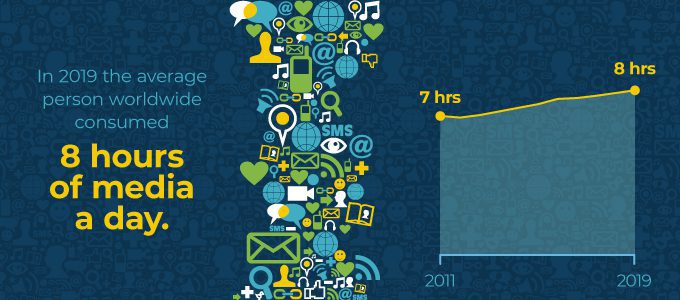
In 2019, the average person worldwide consumed 8 hours of media every day. This is up from 7 hours in 2011.
And as people consume more, the ocean of online content grows. So – besides making sure what you’ve written is engaging and relevant – how else can you arm yourself in the uphill battle of getting content noticed online?
The answer: VISUALS
By visual content within an article, you can mix up the outdated text-only format and keep readers’ attention for longer. Here’s how:
3 aspects of a successful piece of visual content
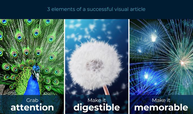
We’re all aware we live in an age of digital information overload – it seems everyone wants a slice of our attention pie. To cut through the deluge and make an impact on audiences, there are three key things to keep in mind.
1. Grab attention
One of the most important elements of an article is the headline. Second comes the supporting graphic. Master the combination and you’ll be drawing readers in from far and wide.
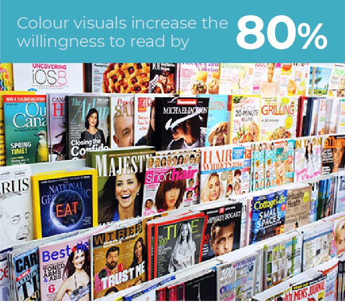
As the widely quoted 3M study conducted by the University of Minnesota states, colour visuals increase the willingness to read by 80%. Using a graphic header alongside relevant imagery can help attract attention.
2. Make it digestible
It’s usually quicker, easier and more convenient to show someone how to do something than tell people how to do it. The same can be applied to many types of information.
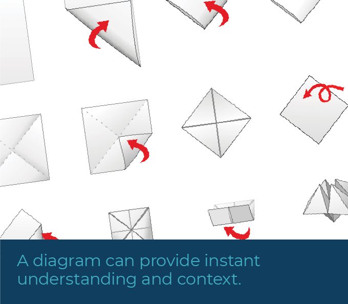
How many times have you read instructions and struggled to follow them? More often than not, a diagram can provide instant understanding and context. Often, relationships and concepts can be more clearer shown through a graphical context.
This is why it makes perfect sense to invest some effort into creating visual assets which support your article or content. You’ve put the time in to write the piece, so why not make it easier and more enjoyable for your readers to understand?
3. Make it memorable
Why do you remember certain articles you read, but not others? It’s usually down to a piece having an emotional hook, a novelty factor, or strong visuals.
Not all pieces of online content lend themselves well to playing on people’s emotions or being quirky and unusual. But with well-thought out graphics, you can definitely make the most of the power of visuals.
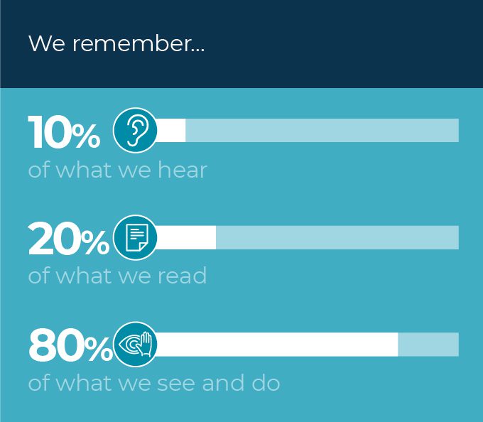
People remember 10% of what they hear, 20% of what they read and 80% of what they see and do. By using graphics to explain and visualize your content, you can help your readers retain and recall information much more easily.
Where to start: a menu of visual options
Visuals are engaging, quick to digest and easy to recall. On top of that, they also offer new ways for content to be shared – SlideShare, Pinterest, StumbleUpon – to name just a few.
The wireframe below shows examples of possible visualisations to include in an article or piece of content. This example includes all the elements for demonstration, but a combination of a few can work just as well.
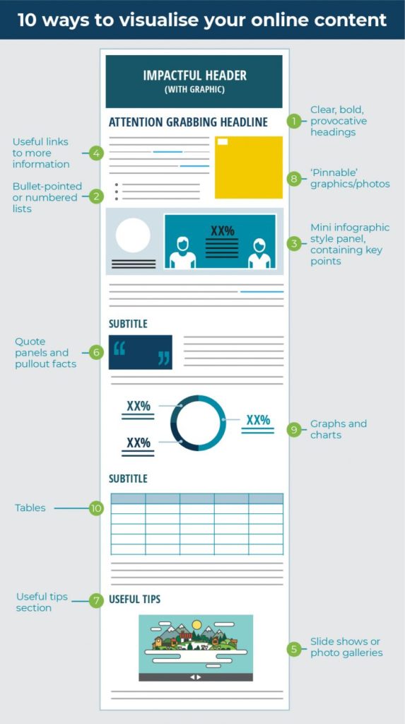
1. Clear, bold, provocative headings
You’re probably already using a different font for these – maybe bold, a touch bigger, and in colour? See whether there’s a condensed version of the font – you can make your header look oversized within the same space to really maximize attention.
2. Bullet-pointed or numbered lists
These break up long sections of prose, making content easier and quicker to read and are especially effective when combined with visuals and icons. It’s exactly the same principle as good presentation design – treat them as key ‘take away’ pointers.
3. Mini infographic-style panel
Key information can be pulled out into feature panels to illustrate a point, process or fact. These are easy to create within most desktop publishing or word-processing applications, such as Microsoft Word or PowerPoint. Less is more, so use the most attention-grabbing information and add icons or bold numbers as a starting point.
4. External links
Although not a visual asset as such, external links look different and provide basic interactivity. By including useful external links, your readers will be able to gain more information on your topic and use your page as a resource. Make sure they look like links by adding colour or other formatting.
5. Slide shows
Slide shows are easy to create and can be as simple or as complex as you like. They provide variety and interactivity for the reader, allowing them to control how they engage with your content. They’re also an effective way to add visual information without using up too much precious copy space. There’s loads of useful information on SlideShare – in slide format of course!
6. Quote panels
Much like fact panels and pullouts, quotes can be really inspirational when visualised. Format them a little bigger, italic, and where possible, combine with a photo of the author.
7. Useful tips
Summarising your article with a list of useful tips is a great way to help readers put what they have learnt into context. Try adding icons or images to inspire your readers to take action.
8. ‘Pinnable’ graphics
This is cheating really, as you can apply this to any of the 7 visual types above. By including images within your content you can open up a whole new world of sharing for your readers. Well-designed summaries and graphics can inspire new communities to read your content. The key thing here is to make sure you include social image-sharing buttons within your page.
9. Graphs and charts
These are great for telling stories with data very quickly. Use sophisticated colours and keep the surrounding ‘chart clutter’ to a minimum by only showing what is necessary to make your point. A limited colour palette and just the key data helps your audience to understand and retain information easily.
10. Tables
Tables are one of the most basic forms of visualising content, but they have their place in categorising and ordering information for digestion. Use clear hierarchies to show headings, key points and trends. As with graphs, it’s best to avoid clutter.
A great example of visual content is Kevan Lee’s ‘The Complete Beginner’s Guide to Slide Decks: 10 Actionable SlideShare Tips for Maximum Results’. Employing a range of the elements listed above, the format of the article helps the narrative flow and the information to be easily navigated and understood.
3 key take-aways
If all of the above is a little too much to take in as you get started, just remember these three things:
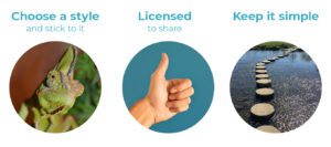
Choose a style and stick to it
This is as simple as choosing a color scheme or font. Photos, illustrations and icons can all be mixed, but try and keep to one style or a couple of colors to provide a cohesive look to your content.
Licensed to share
There are lots of free resources out there to help you put visuals together, but when using imagery from around the web, make sure you attribute and share correctly. There’s a wealth of guidance on Creative Commons as well as a search function to help you find images you can use freely (although some will need attribution).
Keep it simple
The key to great information design is simplicity. Use only what you need to show your core information or add interest. Don’t be tempted to ‘over-design’ or visualise too much – you run the risk of losing your audience. Make sure the narrative is clear throughout.
You can find out more about information design and creating visuals for your content using the following resources. Good luck!
3 tips for more effective content marketing visuals – Content Marketing Institute
This article explains in more detail some of the ideas mentioned above, and has some great additional tips about grabbing your audience with visuals.
Storytelling with data – Cole Nussbaumer
Cole’s no-nonsense approach to information design is easy to follow, and her logical approach to explaining best practice is memorable and comprehensive.