Archives of #Charts

Visual content: 10 ways

From news articles and blogs, to tweets and eBooks – these days, we’re reading (or at least skimming) so much more visual content than we’ve ever done before. In 2019, the average person worldwide consumed 8 hours of media every day. This is up from 7 hours in 2011. And as people consume more, the […]

5 tips for professional graph design

As businesses become more and more data-driven, so it follows that the professional graph design, charts and visualisations that communicate this data are more important than ever. Data is everywhere in our daily lives. We see it being presented in so many slick and attractive ways, on fitness trackers, weather apps, software dashboards, even TV […]

The science of infographic design

We love the challenge of using our knowledge of how the brain works and the design principles that stimulate it to solve the problem of presenting complex information so that it becomes more easily digestible and more memorable. The process of unravelling reams of data and creating a visual narrative that tells the story uncovered […]

Use animation to make your visual report jump out from the crowd

When you see something moving out of the corner of your eye, it instantly catches your attention. It could be a butterfly, your pet, or someone creeping up on you. No matter how much you don’t want to be distracted, whatever caused the movement now has your full attention. Animation uses the same principle to […]
good-presentation-design

3 powerful ways to improve your organisation’s presentation design

Presentations can be a compelling way to showcase your knowledge, experience and specialisms. Delivering a successful presentation is not just about how you speak, it’s also about the quality of the supporting information you use. For most of us, this comes in the form of a slide deck. A great set of slides grabs the […]

How to show multiple datasets

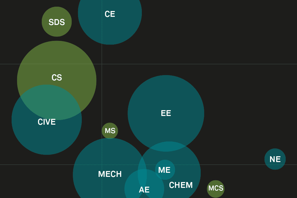
A little something I’ve been working on whilst waiting for some content through for client projects. I wanted to play around with showing 3 data sets on the same chart. Why didn’t I go into Petroleum Engineering?!

A day in the life of an information designer

I’m often asked “So, what is it that you actually do?!” Well, here is a typical working day for me… My first act of the day – no surprise – is to check my emails (if I wake up before my daughter that is). Most of my clients are US-based so I tend to receive […]